

Which Concentration’s On Top?
Which concentrations draw crowds? Which ones are students most loyal to?
Introduction
From the moment you step onto campus, concentrations come up constantly in conversation and define your version of the Harvard academic experience. But tedious Harvard intros and decision anxiety aside, what are the most and least common concentration paths students take?
Data
We explored this question by examining data from the Fields of Concentration Handbook provided by the Faculty of the Arts and Sciences. The handbook includes annual records of the number of students enrolled in single and joint concentrations. For this investigation, we referenced data from graduating classes from 2012 to 2021 to discern patterns in specific concentrations and across broader areas of study called field clusters. All Harvard concentrations are categorized within 9 field clusters to better understand the intersection of each subject within other related disciplines.
GitHub repo with raw data, cleaned data, and analysis: our link here
What’s the most popular concentration?
Economics has remained the most popular concentration at Harvard over the previous years, accounting for around 30-40% of the student body’s enrollment. Though Economics has seen a slight decrease of 5% enrollment within the past 6 years, it continues to remain around the 35% marker and indicates the overall perception and large presence of this concentration within Harvard.. As more students lean towards economics as a concentration or a secondary, one can assume that others make way within their schedules to experience Harvard’s world-renowned Economics classes.
What’s the most popular “type”of concentration?
From Harvard’s 9 field clusters, Quantitative Social Sciences has remained the most popular type of concentration for the last decade. Economics concentrators account for a majority of the Quantitative Social Sciences cluster’s concentrators. Another major contribution to the popularity of quantitative social sciences is due to another one of Harvard’s most popular majors, Government which falls under the same category.
What’s the most popular concentration within each field cluster?
The most popular concentrations within each field cluster are listed as followed (Class of 2022 Data):
- Life Sciences: Psychology (217)
- Physical Sciences: Mathematics (98)
- History: History (132)
- Languages and Literature: History and Literature (103)
- Engineering: Mechanical Engineering (84)
- Qualitative Social Sciences: Government (364)
- Quantitative Social Sciences: Economics (660)
- Arts: Art, Film and Media Studies (43)
- Math and Computation: Computer Science (390)
How has concentration enrollment changed over time?
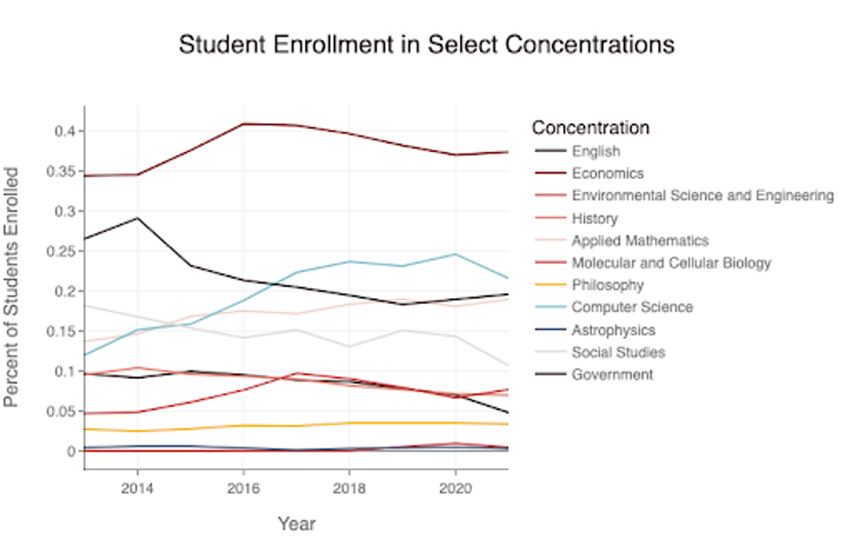 Figure 1: We choose 1-2 concentrations from each field cluster to examine change in enrollment from 2014-2020. Economics remained the most popular for all 6 years.
Which concentrations have experienced the most growth?
From the concentrations we analyzed, computer science has had the highest growth in enrollment since 2014. It has risen from 10% to approximately 22.5% of students enrolled. This data aligns with the significant growth of the tech industry during the same time period, as students can land well-paying jobs with a bachelor’s degree in Computer Science.
Economics has consistently remained the most popular concentration, ranging from 35 - 40% of students, with a sharp increase from 35% to 40% from 2014 to 2016. It now rests at approximately 37.5% of students enrolled.
Which concentrations have experienced enrollment declines?
English and social studies have declined the most from 2014 to 2020. English dropped from 30% to 20% and social studies from approximately 15.75% to 10.00%. This could be attributed to students having higher interest in more “employable” concentrations, which are found in more quantitative and STEM-related field clusters. Our analysis of annual enrollment in field clusters highlights this same popularity for quantitative social sciences, which have an emphasis on scientific data analysis.
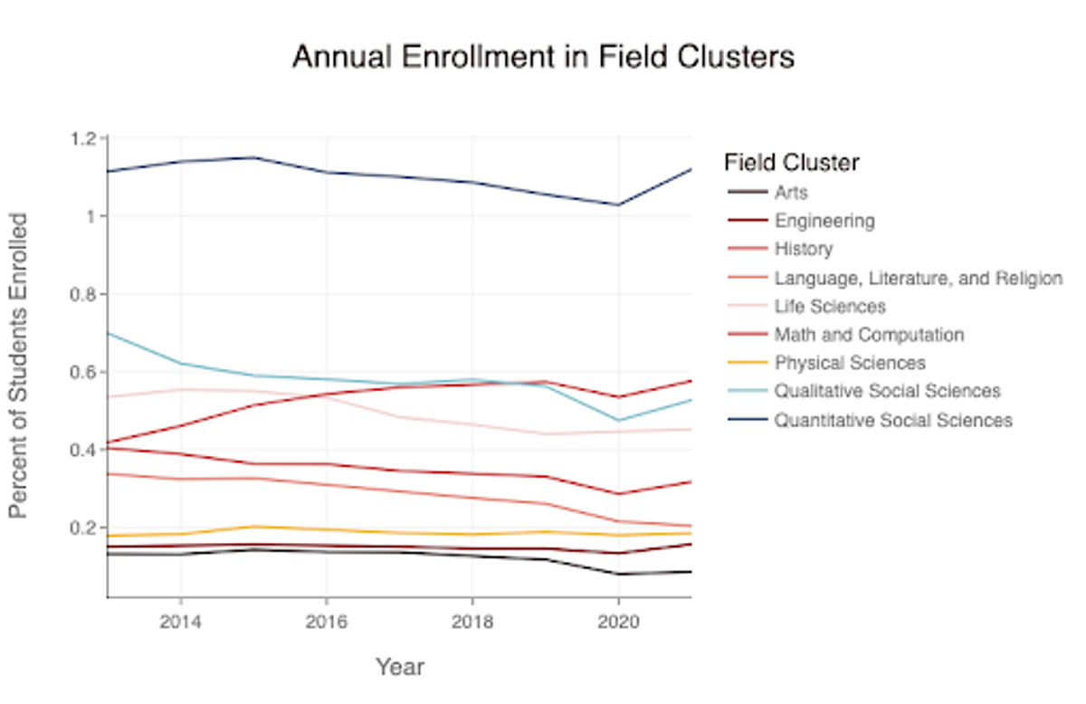 Figure 2: Percentage of graduating students receiving degrees in each field cluster from 2013 to 2021.
How does joint concentration enrollment differ across concentrations?
Students may approach the pursuit of two subjects differently than the pursuit of a single subject, so we were curious about the relationship between joint concentration enrollment and single enrollment in a concentration.
How has joint concentration enrollment changed over time?
In order to capture the full spectrum of students choosing to pursue a particular concentration in combination with another one, we chose to treat primary joint concentrators (for subject A, those taking Subject A + Subject B) and secondary joint concentrators (those taking Subject C + Subject A) as equivalent, adding primary and secondary joint concentrators for each subject and dividing this sum by the number of single concentrators (only Subject A) to determine the ratio of joint concentrators to single concentrators within each subject. We then analyzed the variation in these ratios over time for the same representative concentrations we used previously.
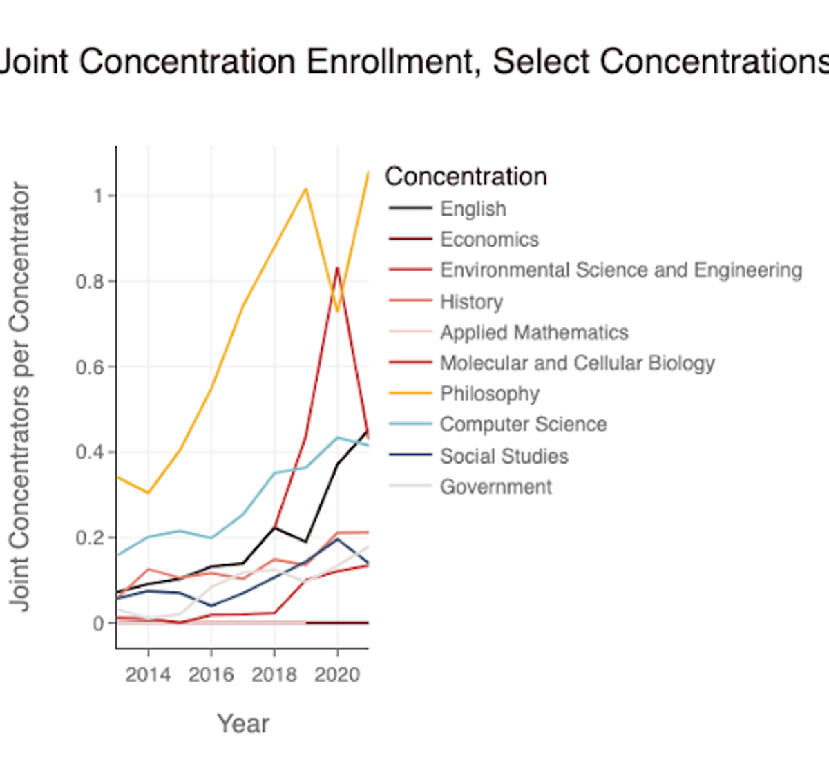 Figure 3: Joint concentration enrollment from 2013 to 2021 for 10 concentrations chosen as representatives of the nine field clusters. Astrophysics was excluded from this graph despite its use as a representative in previous analyses due to an outlier of 10 joint concentrators per concentrator in 2016.
 We found that joint concentration enrollment was relatively erratic, varying greatly between individual concentrations and from year to year, but increased over time for most concentrations. We also saw that the ratio of joint to single concentrators was less than one at all timepoints for most concentrations, indicating that most Harvard College students prefer, at least formally, to devote themselves to a single area of study.
Which concentrations are most popular as joint concentrations?
Given the lack of homogeneity in joint concentration enrollment profiles over time, we chose to analyze joint concentration popularity through a more generalized approach rather than representative concentrations, relying on field clusters and correlational analysis.
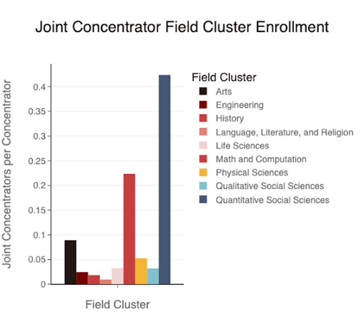 Figure 4: Average ratio of joint concentrators to single concentrators (from 2013 to 2021) for each of the nine field clusters. Quantitative Social Sciences, Math and Computation, and Arts were the most popular joint concentration options, while Language, Literature, and Religion; History; and Engineering were the least popular.
Despite the popularity of Astrophysics above Applied Mathematics and Economics in our previous graph, Quantitative Social Sciences was the most popular field cluster for joint concentrations, with Math and Computation the second most popular. Language, Literature, and Religion, alongside History, was the least popular. All field clusters except for Quantitative Social Sciences, Math and Computation, and the Arts had less than 0.05 joint concentrators per single concentrator. The dearth of joint concentrators in History may be explained by the existence of concentrations within the History field cluster that already combine more than one discipline, such as History and Literature. Nonetheless, the preference for joint concentrations in fields popular for single concentrators suggests that students use joint concentrations to combine concentrations that are already popular and widely enrolled in by the general student population; joint concentrations favor joint study of already popular disciplines over the integration of undervalued subjects with more popularly subscribed concentrations.
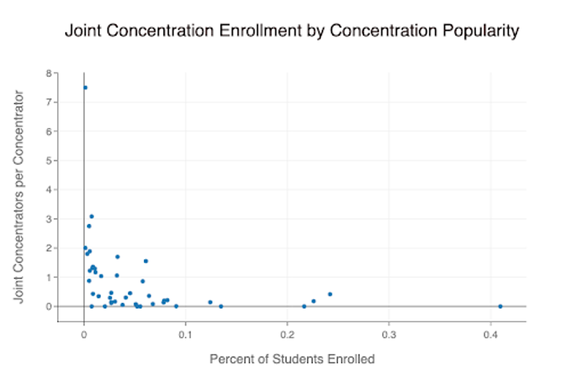 Figure 5: Joint concentration enrollment compared to the percent of students enrolled in the same concentration, average from 2013 to 2021. The least popular concentrations had the highest joint concentration enrollment, while the most popular concentrations had the lowest joint concentration enrollment; however, this relationship was true only for concentrations with extreme enrollment profiles (less than one percent or more than ten percent of the student body).
We plotted joint concentrator abundance against the percent of students generally enrolled for all concentrations to further examine the intersection between joint and single enrollment. The least popular concentrations generally had the highest joint concentrator enrollment ratio, while the more popular concentrations had fewer joint concentrators relative to the size of their single concentrator population. Meanwhile, data for concentrations without extremely low (less than one percent) or high (more than ten percent) proportions of the student body enrolled did not indicate any significant relationship between the popularity of a concentration by itself and its relative popularity as a joint concentration. This suggests that the relationship between joint and single enrollment indicated by field cluster enrollment may be misleading, and student joint concentration enrollment choices are far more varied than can be inferred from a generalized approach.
Conclusion
Limitations
The field cluster designations made by the College unfortunately designate several concentrations as residing within more than one concentration. This leads a few concentrations to be overrepresented in aggregate views of our data within field clusters, potentially providing misleading views of the popularity of specific focus areas within the student population. Thus, our focus on field clusters as a means of analyzing our complex dataset in a more understandable manner may have prevented us from deriving more nuanced and representative conclusions. However, this did not impact our analysis of enrollment in individual concentrations.
Our data set also only included concentration data from approximately the past 10 years. Having a smaller time-frame for our data limited our ability to analyze the relationship between Harvard concentration enrollment and variations in the job market. For example, concentration data starting in 2000 would have allowed us to view changes in Computer Science enrollment dependent on the boom of the technology industry. More extensive data would allow us to better understand trends in concentration preferences over time by differentiating random shifts in preferences from lasting ones.
Expansion
This project could be expanded by differentiating between primary and secondary joint concentrations and examining the impact of each concentration department’s funding on its popularity. This would require gathering data from individual concentration departments. With more data, we can also replicate this analysis for secondary concentrations.
Another potential project would be to research students’ switches between concentrations. This would allow us to determine the likelihood that students coming in with a specific concentration (i.e. government) will change it to any other concentration, or the rate that students in one concentration switch to another (i.e. from economics to English).