
Q's about the Q guide
How effective is the Q Guide? And what can it tell us about the STEM-Humanities divide?
Introduction
For 45 years, the Q Guide has served as an invaluable resource for Harvard students choosing their classes. It provides many data points for each class, but perhaps the most salient are the overall course rating and the weekly workload.
The benefit of this data lies in its potential to drive us toward well-taught classes and away from poorly-taught ones. A potential harm lies in its ability to enable our baser instincts: maybe we like easier classes more than hard ones, and maybe the Q guide makes it easier to act on that.
We set out to explore the potential impact of the Q guide by answering the following questions. Do high course ratings correlate with increases in enrollment (and vice versa)? And do high workloads correlate with low course ratings (and vice versa)? Along the way, we happened on some interesting results about the STEM-humanities divide at Harvard.
Data and Methods
We collected our data directly from the Q guide with a Python scraper using the Selenium library. We limited ourselves to courses offered in Spring 2018 and Spring 2019. For each course, we collected the department, overall rating, "recommend to a friend" rating, workload, enrollment, and the "reason enrolled" responses—as an elective, concentration requirement, Pre-Med requirement etc.
We cleaned our data and conducted analysis in R. To clean our data, we excluded courses offered in only one semester or with incomplete data. We also converted absolute changes in enrollment to percent changes to standardize between class types (e.g. seminar versus lecture).
Our analysis centered around four relationships: workload versus enrollment, rating versus enrollment, workload and rating versus enrollment, and workload versus rating. By accounting for both factors in the third regression, we hoped to control for workload and determine a truer relationship between rating and enrollment. Within each relationship we also ran separate regressions that included interaction terms and indicator variables for both the most common reason taken and the department.
Insights
The Typical Harvard Course
A common problem with rating systems like Yelp’s or Uber’s is that responses skew high and rob users of the full theoretical range of a 1-5 rating system. Perhaps unsurprisingly, Harvard’s Q guide also suffers from this grade inflation. The average overall course rating across the University is 4.13/5, with a standard deviation of 0.6. Workload averages 5.9 hours per week, with a standard deviation of 2 hours.
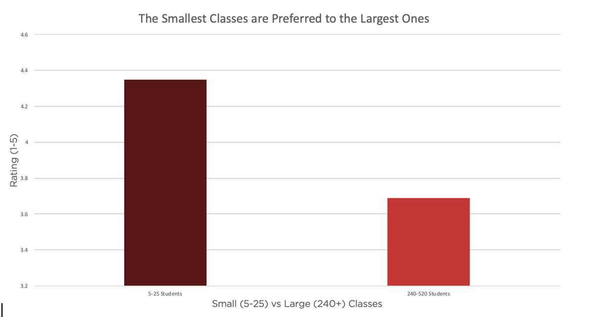 Average course ratings for smallest (5-25 students) and largest (240-520) Spring classes at Harvard.
Below are the same averages for the 15 largest spring classes by enrollment. Almost all of the largest classes have below average course rating, and collectively average a 3.69/5. This is notable especially in comparison to the 4.3/5 average rating of classes with 5 to 20 students. The figures differ by 1.25 standard deviations, suggesting a substantial pedagogical benefit in smaller classes. An alternative hypothesis is that the largest classes often cover introductory material which is by its nature less interesting than what's covered in seminar-style courses. The largest classes also largely exclude the humanities, whose course ratings run higher than the University average, though this might be due to the humanities’ emphasis on small seminar-style classes.
 Reported workload in hours per week outside of class for Harvard’s 15 largest Spring classes by enrollment.
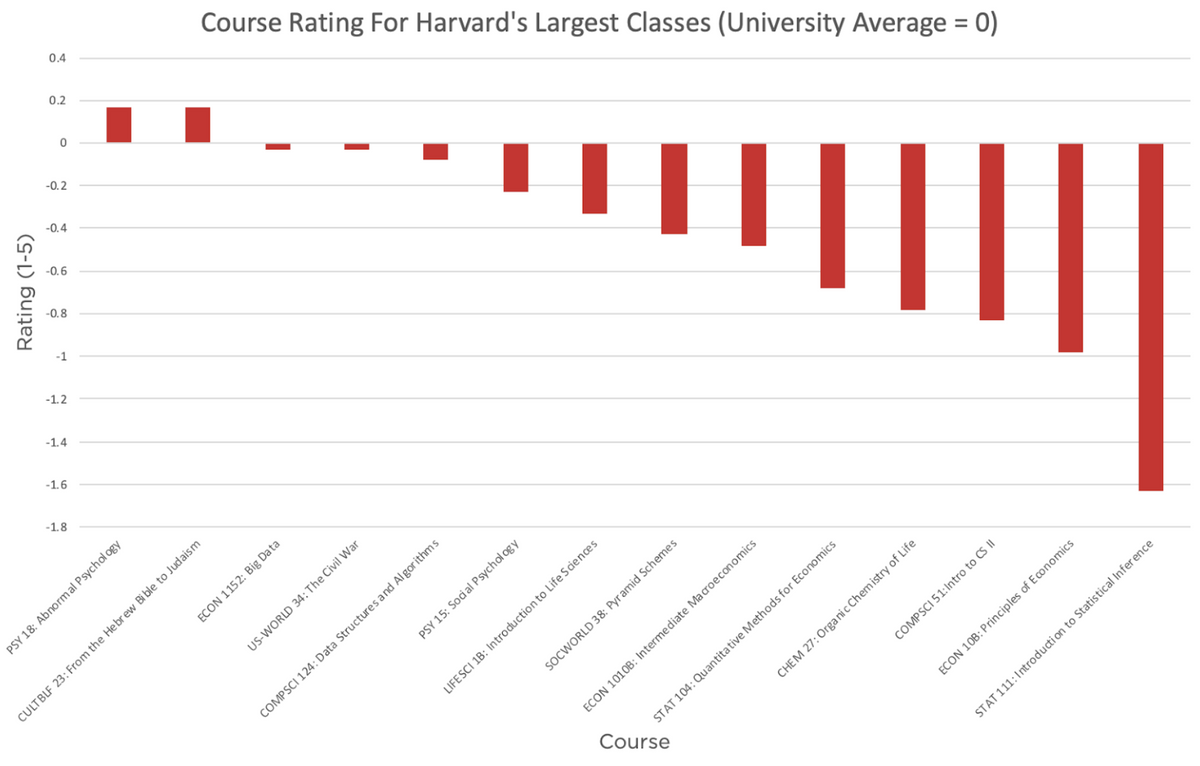 Course ratings for Harvard’s 15 largest Spring classes by enrollment (university average = 0).
The Typical Harvard Department
Below are the average (weighted by enrollment) course rating and workload for the twenty largest departments at Harvard by total enrollment in classes offered. We graph their difference with the University averages (4.13/5 and 5.9 hours) to highlight differences.
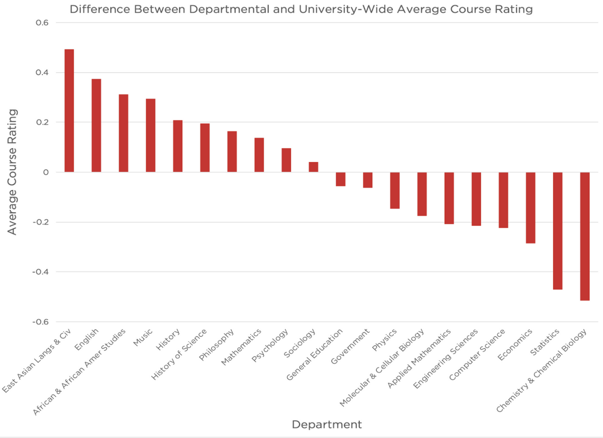 Average course-ratings by department (university-wide average = 0).
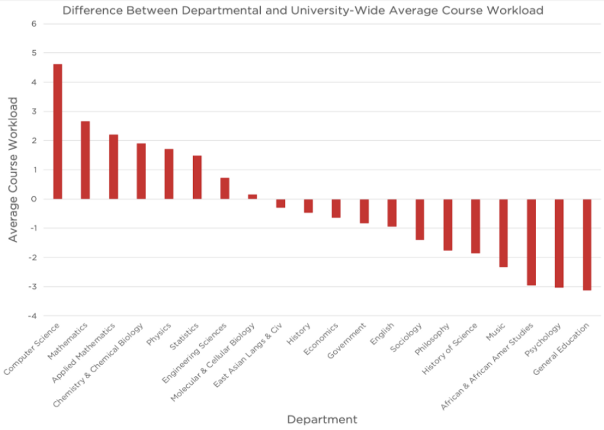 Caption: Average workload by department (university-wide average = 0).
Every STEM department listed has an above average workload, and every non-STEM department has a below average workload. Furthermore, with the exception of Mathematics, every department with above-average workload has below-average ratings. In fact, the average workloads and ratings for these departments have a correlation of -0.5, which suggests the possibility of non-random correlation, especially given the surface-level plausibility of an inverse correlation between workload and rating.
However, the correlation between workload and rating for classes within a particular department is lower. For example, among Economics classes the correlation is only -0.23. Over all classes across the University, the correlation of workload and rating is near zero. This tells us that the initial correlation of -0.5 does not follow directly from individual classes’ workload and rating variables.
This would mean that workload was merely a confounding variable, masking something about humanities classes that relates to their higher ratings.
What Impacts Enrollment?
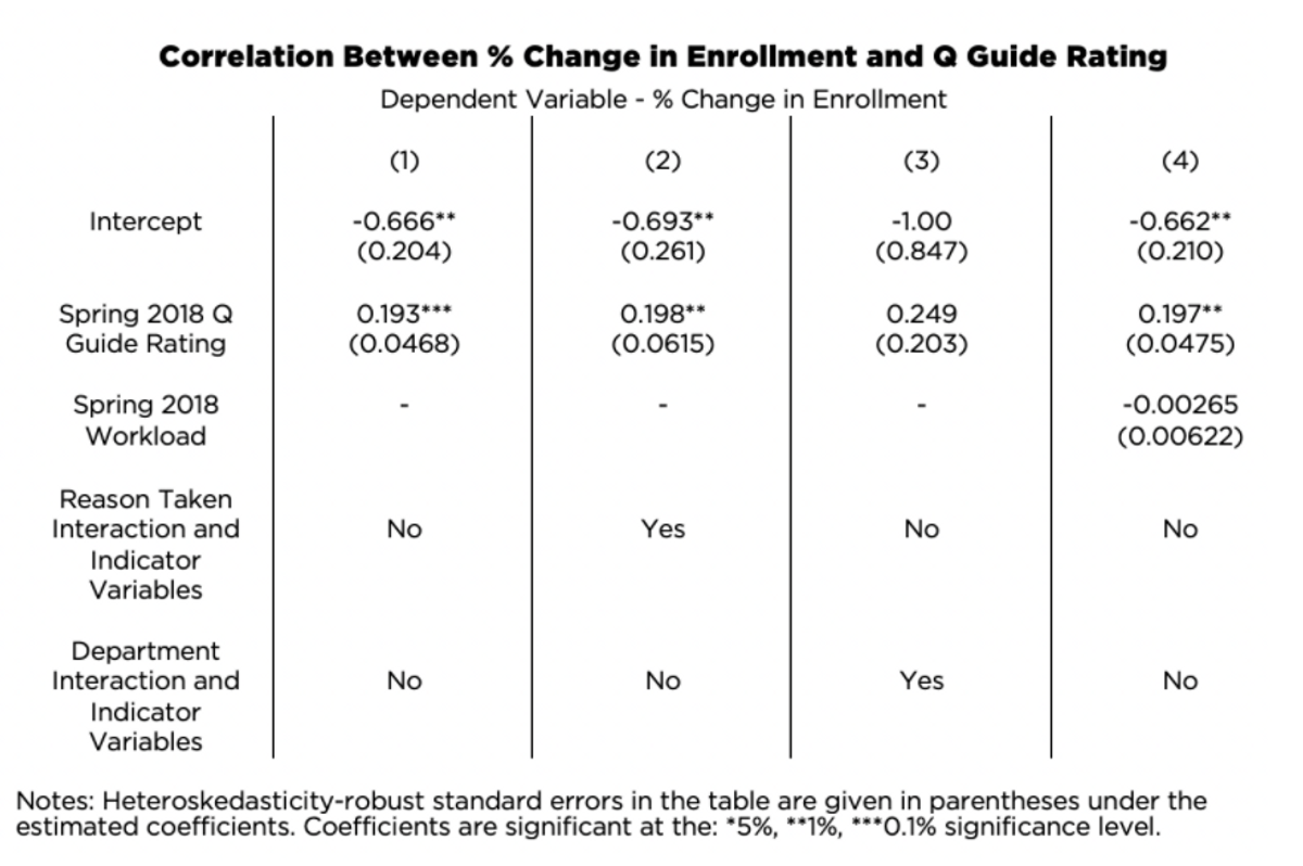
This table displays our most interesting regression results. Regressions can be read length-wise and share a common dependent variable (% change in enrollment). For example, the first column indicates that without taking into account workload, reason taken, and department, we expect course enrollment to decrease by 66.6% year-to-year (-0.666). However, we expect there to be 19.3% increase in enrollment for every additional point in its Q Guide score.
Our major findings lie in the relationship between rating and enrollment in the following year; there was a statistically significant positive association between the two variables.
This translates to just under a 2% increase in enrollment for every 0.1 increase in rating. Our interaction and indicators variables were not statistically significant, suggesting that Harvard students’ sensitivity to rating did not change based on their reason for taking courses nor the department they were in. Indicator variables allow for the intercept of the regression to change; in other words, is the “baseline” score affected by why the course was taken or what department teaches it? Interaction terms allow for the slope of the regression to change; in other words, does the score change more or less dramatically based on why the course was taken or what department teaches it?
Although our regressions for workload and regression did yield a negative association (i.e. as workload increased, there was a negative percent change in enrollment in the following year), we were unable to draw significant conclusions from it. Our results from analyzing the relationship between workload and rating showed a slight positive association in the dataset, but we were unable to draw significant conclusions from it.
Conclusion
So does the Q Guide work? It certainly seems that the Q Guide drives students toward better-taught classes; at the very least, we found a correlation between higher ratings and higher future enrollment. It also seems that the Q Guide is not a glorified gem-finder: we found no correlation between workload and future enrollment. The Q Guide comes out of our examination looking pretty good.
What about the classes themselves? Students significantly prefer the smallest classes to the largest ones. This disparity is probably unavoidable, but its size reminds us that Harvard’s biggest classes have a lot of room for improvement. The STEM-humanities rating divide also stands out. Notably, we eliminated differences in enrollment or class size as possible explanations for this divide. This suggests that the disparity has deeper roots. Barring the possibility that the humanities are simply more fulfilling (though maybe we shouldn’t!), those roots should be addressed.