
MBTA Showdown: Best College MBTA Station
Analyzing ridership across the Boston college T stations!
Introduction
All aboard! For as long as the Harvard Square train station has existed, Cambridge residents and Harvard students have been riding the MBTA, or T, to travel all across Greater Boston. The Red Line is a Harvard student’s best friend to travel outside of campus, from frat parties at MIT to dim sum in Chinatown. With that said, Harvard is not the only college in town! Everyday, slews of students from colleges all across Boston are using the T to get from point A to point B. With so many different colleges all connected through the MBTA system, how does each school’s use of the MBTA compare? Which school uses the T the most? How long do students have to wait?
To answer these questions, we turned to the MBTA open data portal, which provides statistics like number of rides, ride times, wait times, and more. For the purposes of our analysis, we looked at ridership, the MBTA’s word for number of people swiping into a T station, and wait times. We looked at data from 2019 through 2022, including 8 different schools. Below is a map of the eight stations that we looked at. Going forward, we will refer to these stations by the name of the college that they’re associated with.
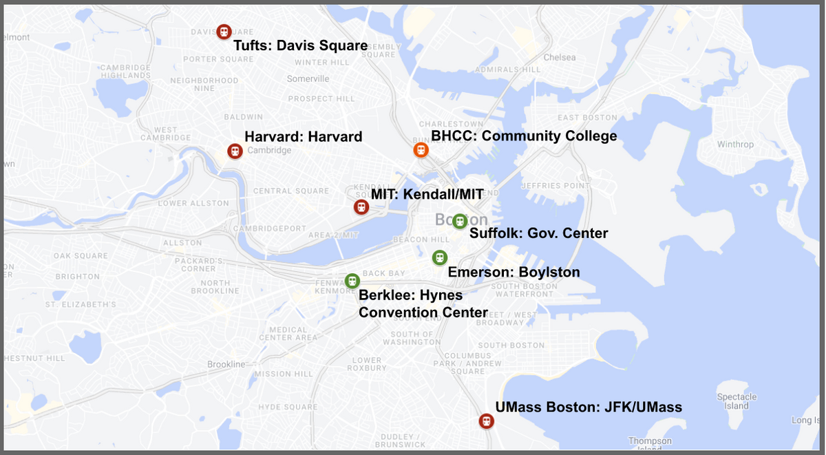 Figure 1: The above map indicates the locations and MBTA line (red, green, orange) of each college’s respective station used for this article’s study.
Disclaimer: You might be thinking, “why isn’t BU, BC, or Northeastern included on the map? This is an outrage!” Well, we’re right there with you. We think it is an outrage too! Unfortunately, the MBTA doesn’t provide any 2022 data on the T stations near those schools, so we’ll have to make do. Let’s get started!
Ridership in 2022
To begin our comparison, let’s take a look at ridership data from 2022. As a reminder, ridership is just the MBTA’s term for the number of people who’ve swiped into a T station. This should provide a good metric of how often people use each respective T station. Using the map from above, we’ll check the ridership of the station nearest to each school.
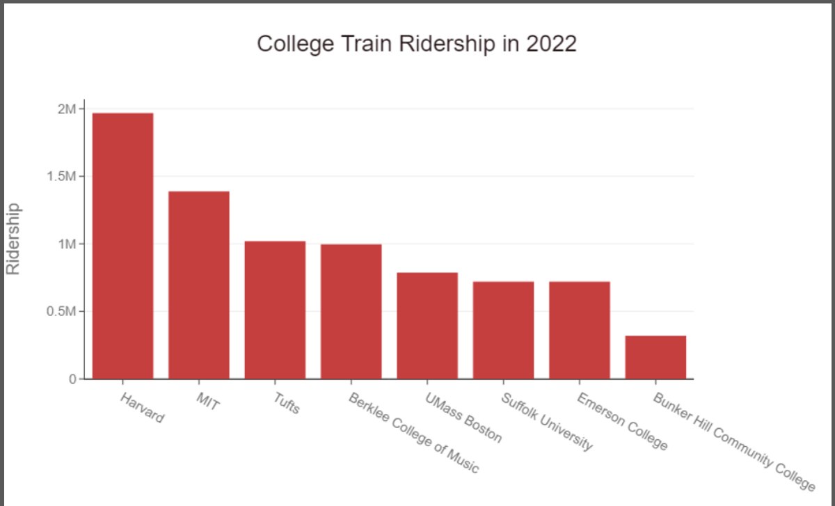 Figure 2: The above graph shows the number of T rides in 2022 for the train station nearest each of the labeled colleges
Right off the bat, we can see that Harvard comes out on top with the highest ridership at just under 2 million swipes/year, followed by MIT with under 1.5 million swipes/year and Tufts with 1 million swipes/year. Bunker Hill Community College (BHCC) had the lowest ridership in 2022 with less than 0.5 million swipes/year.
Harvard’s lead in ridership for 2022 shouldn’t come as too big a surprise: it is a crucial station for both Cambridge residents and Harvard students alike. For Harvard students, the T is the cheapest way to travel outside of campus if you want to avoid an expensive Uber.
Another potential reason for the large discrepancy between Harvard and MIT’s ridership is MIT’s shuttle system. While Harvard’s shuttle service only takes students around its Cambridge and Alston campuses, MIT’s shuttle takes students directly from its Cambridge campus to Boston’s Back Bay. With that said, MIT still has the second highest ridership, perhaps due to the rise of biotech firms around MIT and Kendall Square that attract commuters to the Kendall Square station for work.
Ridership in 2019
Now that we’ve seen the rankings for 2022, how were things different before COVID-19? To answer that, we will look at ridership data from 2019.
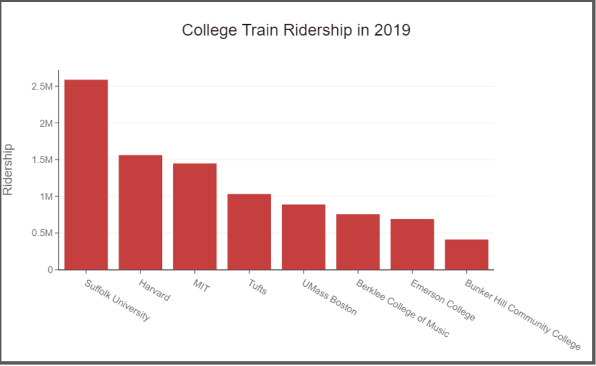 Figure 3: The above graph shows the number of T rides in 2019 for the train station nearest each of the labeled colleges
Whoa whoa, where did Suffolk University come from? While Suffolk only saw around 0.75 million riders in 2022, the same station received over 2.5 million swipes in 2019. On top of that, Harvard received about 0.5 million less riders in 2019 than it did in 2022.
To help explain this, it’s important to point out that the train station we are using for Suffolk University is Government Center. Although this is the train station that Suffolk recommends for students to use when traveling to and from campus, Government Center is also an important station for non-students. In fact, Government Center is conveniently located right by popular destinations like Boston Commons, the Old State House, and Fanuel Hall to name a few. Therefore, it is possible that Suffolk University's primary T stop, Government Station, simply receives non-student riders much more frequently than other college T stations. These non-student riders could be tourists and everyday workers.
There’s just one problem, however. If Government Center simply receives more non-student riders than everywhere else, then why were the numbers for Suffolk so much lower in 2022? One likely possibility is COVID-19. COVID-19 caused a major transition to work from home, and it also significantly reduced tourism for a couple years. It’s possible that those effects are still lingering in 2022. In addition, the Government Center station and Green Line in general have been undergoing major renovations in recent years. The MBTA has replaced Government Center trains sporadically with shuttles, further reducing the ridership from Government Center.
In order to confirm our theory, let’s take a closer look at differentiating between student riders and everyone else.
Ridership During School vs Summer
To continue our comparison, let’s look at how many of these passengers are actually college affiliates rather than just travelers on the train. Unfortunately, we cannot mark each individual rider as a student or a non-student; instead, we will be comparing riders during the school year versus riders during the summer (June, July, August) under the assumption that most students are not on campus during the summer and only use the T during the school year. While there may be confounding variables, looking at the difference between these two values should give us an estimate for how many of the riders are actually students.
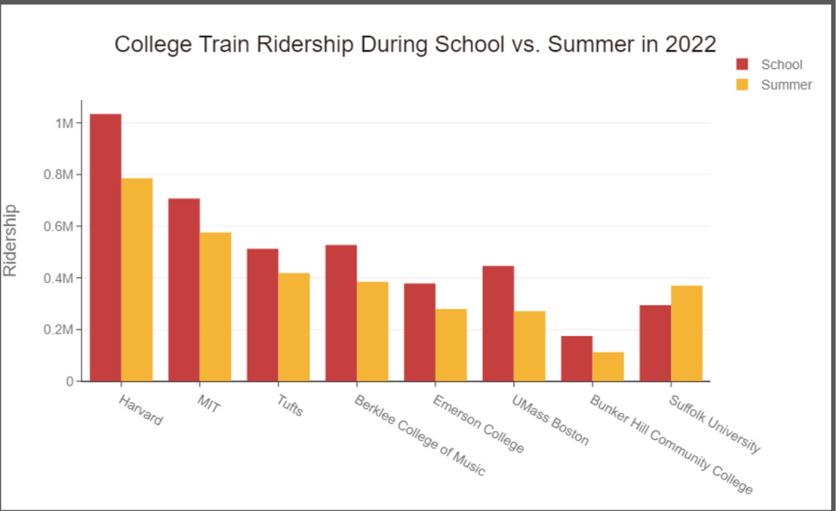 Figure 4: The above graph shows the number of T rides in 2022 for the train station nearest each of the labeled colleges, separated into rides during the school year and summer
The graph above shows travel to the station corresponding to each school during the school year versus during the summer. We can see that all schools other than Suffolk University see more riders during the school year than during the summer. We can analyze this more in the graph below.
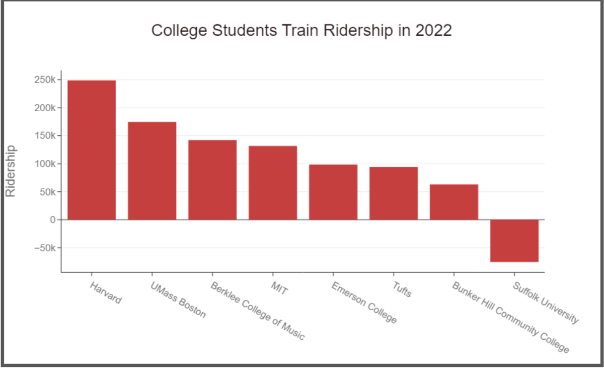 Figure 5: The above graph shows an estimate of the number of T rides taken by students in 2022 for the train station nearest each of the labeled colleges
Here, we’ve subtracted the number of riders during the school year by the riders during the summer in order to single out student ridership. We see that Harvard has the most active student riders by a significant margin followed by UMass Boston and Berklee who have about 70k and 100k less student travelers than Harvard, respectively. On the other end of the spectrum, however, we’re met with a bizarre result of negative student ridership at Suffolk University. While confusing at first, the negative result makes more sense when we remember how the station by Suffolk University, Government Station, is a key station for work commuters and tourists during the summer. Suffolk University is simply an outlier because it receives greater ridership during the summer when compared with the school year.
Wait Times
The purpose of the T is to help Bostonians get around, and it can be frustrating to wait a long time for the train to arrive or to have a slowdown in the tunnel. In addition to comparing ridership, we wanted to understand wait times for the T at Harvard Station. We found that, in 2021, the mean wait time was around 9 minutes and 15 seconds, with the vast majority of the wait times distributed between 4 and 15 minutes. This is in line with the MBTA’s goal to maintain 9 minute headway times on the Red Line. However, roughly 10% of wait times were greater than 15 minutes, with the longest wait times reaching above 30 minutes. Odds are, if you are traveling at rush hour, you won’t have to wait long for a train, but if you're traveling off hours, like many college students, be ready to experience longer waits.
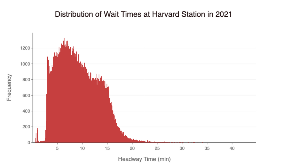 Figure 6: The above histogram shows the wait times experienced at Harvard Station in 2021
We also looked at how wait times varied across the year in 2021. We found that the average daily wait time remained fairly consistent throughout the year, although months of March, April, and May experienced especially long wait times. This is because the MBTA had to pull all of its new fleet of Red and Orange line cars off the tracks after an Orange Line car derailed on March 16, 2021. Additionally, Red Line signal upgrades have been ongoing since 2018, and continue to cause slowdowns and disruptions.
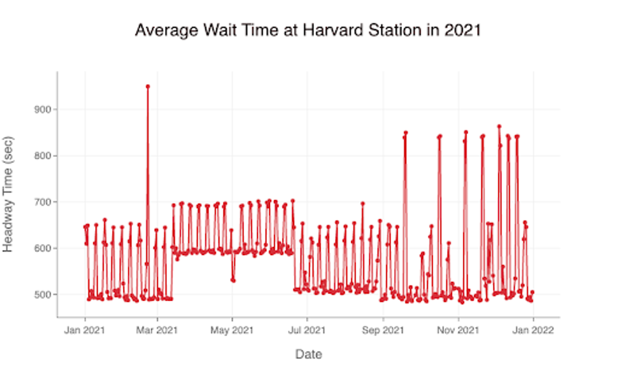 Figure 7: The above graph shows the average waits time at Harvard Station in 2021
These high wait times are especially concerning since the Red Line is the MBTA’s most used line, and since college students need to be able to get across town quickly and easily to attend classes, get to extracurriculars, and go to work. However, the MBTA has launched a Red Line Transformation Program, which is working to add new cars, signaling systems, and maintenance facilities to improve wait time and reliability on the Red Line over the next few years.
Travel Times
Once boarded the train, how long does it take to reach your destination? In addition to wait times, we analyzed travel times on the Red Line from Harvard to Kendall/MIT station. This is a popular route for Harvard students commuting to MIT for classes or parties. In 2021, we found the average travel time to be 485 seconds or roughly 8 minutes. This equates to an average of 15 mph over the two mile journey. For reference, the walk between these two stations takes about 40 minutes. Average wait times were similar in 2022 compared to 2019, although we see a period of elevated travel times (an addition of one to two minutes) from February to May 2022 that is not present in 2019. This is due to a combination of issues including severe winter snowstorms which required frequent track cleaning, slow zones due to the testing of the first few new Red Line cars which are being rolled out over the next few years, and preparations to switch over to a new digital signal system. Overall, travel times are quite good when compared to walking, although maintenance and improvements continue to cause disruptions for now.
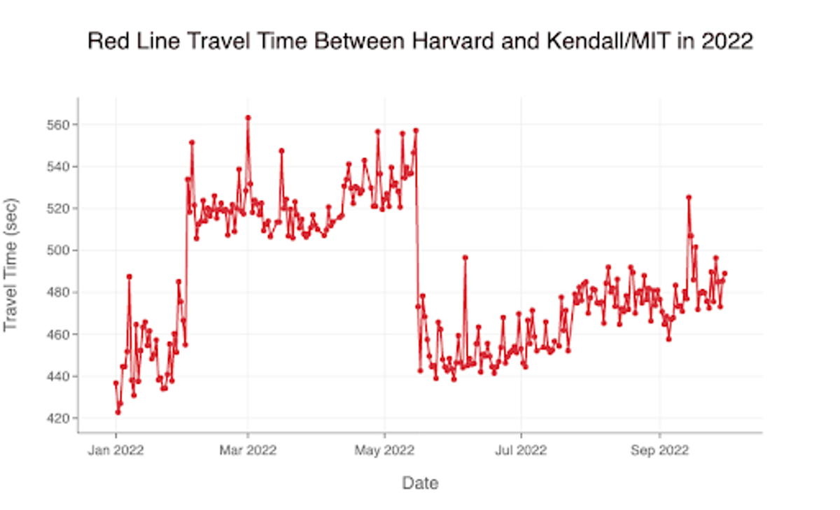 Figure 8: The above graph shows how long it would take to ride the T between Harvard and Kendall/MIT in 2022
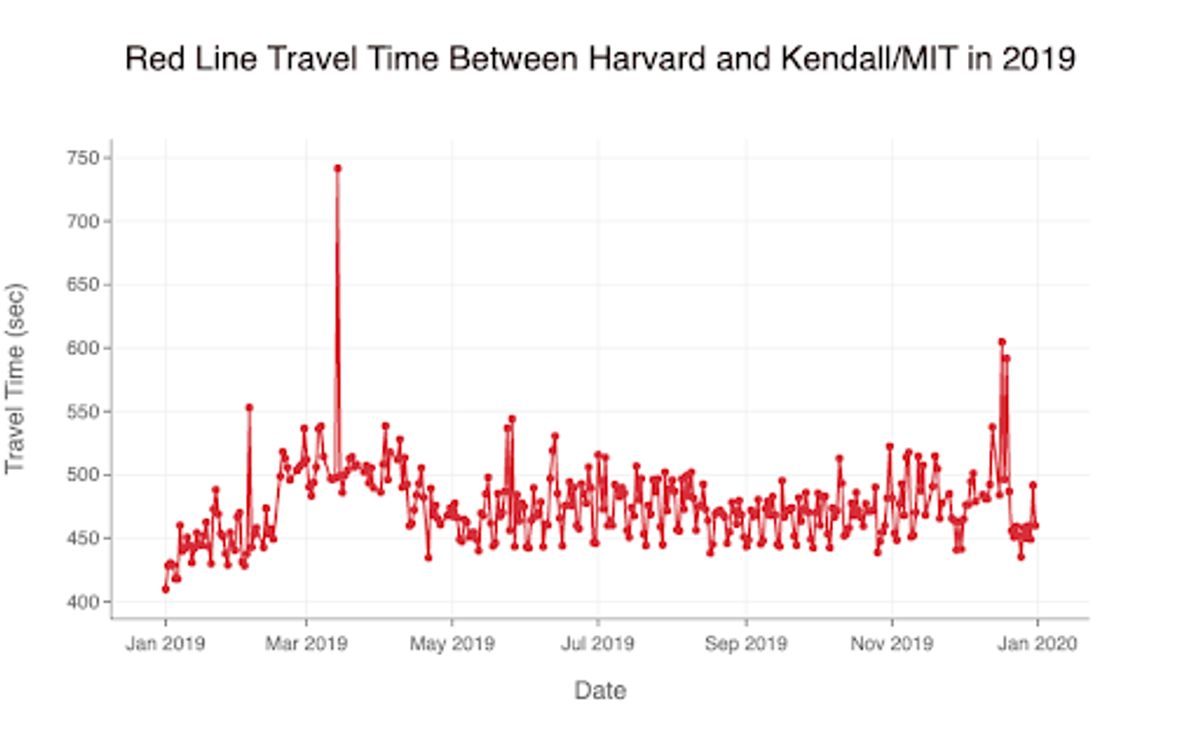 Figure 9: The above graph shows how long it would take to ride the T between Harvard and Kendall/MIT in 2019
Conclusion
In this article, we looked at pre and post COVID-19 ridership data for colleges in the Boston area, the difference in ridership during the summer versus during the school year to assess student travel, and travel times for students using the T. Our results showed that post COVID-19 Harvard was the most popular station, but pre COVID-19, Suffolk had more riders, likely due to the location and the tourist attractions in the area. Also, as a result of the location, we saw that Suffolk was the only station to have more ridership during the summer versus during the school year. Additionally, Harvard had the biggest fall in ridership during the summer, which we assume is a result of students traveling more during the school year. For wait times, we found the average to be 9 minutes and 15 seconds for the T. The amount that students wait though may be longer on average though as students tend to ride during rush hour when trains are less frequent. Finally, travel time on the Red Line between Harvard and MIT is 8 minutes. This is a huge upgrade over the 40 minute walk, so taking the T for a trip to MIT is a worthwhile investment. In the future, we’d like to revisit these analyses once MBTA’s major renovations on the green and red line are completed so that we can see what the impact of adding new stops, modernized signal systems, and upgraded trains would be.
That’s all folks! Thank you for taking the time to read our article and we hope your newfound knowledge of the T will guide you on your journeys exploring the Boston area during your time here at Harvard.