
How well do Google Trends track with COVID-19 data?
Is there a correlation between Google Trends data and increases in COVID-19 cases? A high correlation may suggest that Google data could be used to predict coronavirus spikes before they actually occur.
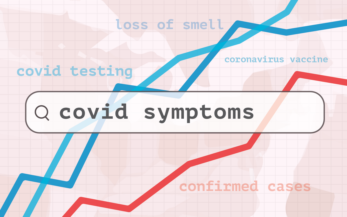
Even with 2020 in the rearview mirror, it is no surprise that COVID-19 remains one of the most discussed topics around the world. Coronavirus-related searches constituted three of the top five Google searches in 2020 in the United States while also topping the list for global searches and news. Until the pandemic ends, this trend will almost certainly continue well into 2021.
As of January 24, 2021, there have been over 25 million confirmed cases and almost 400,000 deaths in the United States alone. The number of cases and deaths are shown below on a logarithmic scale, beginning with the first confirmed U.S. case just over a year ago on January 20, 2020:
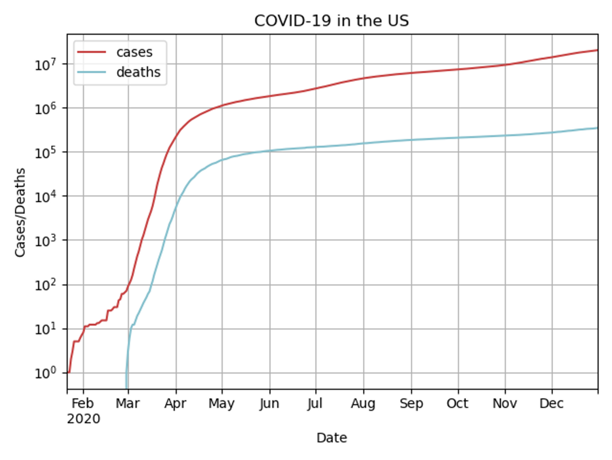
It is concerning that the graph resembles a straight line from May to the end of the year -- this suggests that COVID-19 cases are still increasing at nearly an exponential rate. Furthermore, the graph begins to slope upwards starting in November, which means that the rate of new cases has increased in the past two months.
With this in mind, we wanted to see if there was a correlation between Google Trends data and increases in COVID-19 cases. A high correlation may suggest that Google data could be used to predict coronavirus spikes before they actually occur.
The Data
We used the New York Times’s COVID-19 data for the number of confirmed cases and deaths per day in the U.S. and each state. Data on search term frequency comes from Google Trends, and in our analyses, we considered data from the last 90 days of 2020. This data consists of numbers from 0 to 100 for each day, where a value of 100 indicates the day when the keyword was most popular based on the search term’s proportion to the total number of that day’s searches. A value of 50 indicates a day when the keyword was about half as popular. We then divided by 100 to get a relative search volume (RSV) between 0 and 1.
COVID Correlations
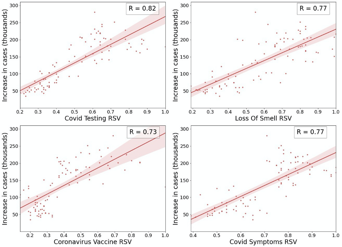
We looked at a variety of COVID-related keywords and their search trends over the past three months. We then found the correlation (R-value) between keyword popularity and daily new COVID-19 cases in the U.S. The four keywords -- or more precisely, key phrases -- we focused on were “covid symptoms”, “loss of smell”, “coronavirus vaccine”, and “covid testing”. The scatter plots are shown below with regression lines and shaded 95% confidence intervals. These keywords all had a R-value greater than 0.70, which indicates a relatively strong correlation between search popularity and daily new cases.
On the other hand, more general terms such as simply “coronavirus” had little to no correlation. Interestingly, the term “face mask” had a moderate negative correlation of -0.55. This suggests that as more people search for the term “face mask” across the country, the number of new cases decreases in general, perhaps because people searching for the term become more inclined to use face masks to prevent the spread of COVID-19.
As further analysis, we wanted to see if Google Trends data could be used to predict surges in new cases before they actually occur. To do this, we shifted keyword popularity data forwards by up to 28 days from the original date, and then calculated the correlation between the shifted data and the increase in COVID cases. In other words, we looked at the association between the number of new cases and popularity scores from previous days. We then plotted the correlation against the number of days shifted for each of the keywords.
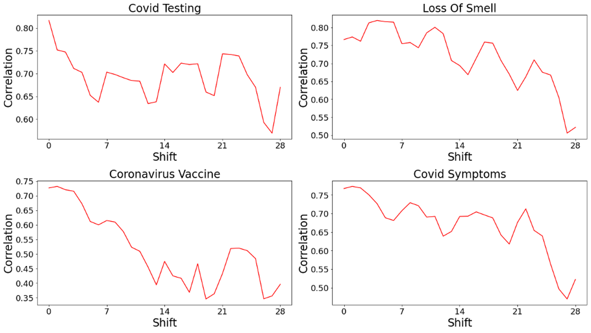
For three of the keywords, shifting the popularity data did not result in a higher correlation. However, for the “loss of smell” keyword, the correlation had a maximum of 0.82 when shifting by four days. While this analysis concerns the United States as a whole, we also found that some states followed trends similar to the entire country. Maryland, Pennsylvania, and West Virginia were three states that had the most similar shifted correlation trends. In contrast, Montana, Iowa, Wisconsin, and South Dakota had shifted correlations that were on average closest to 0, indicating that in these states, Google Trends data was a poor predictor of new COVID-19 cases. Interestingly, these states -- with the exception of Montana -- are a part of the Midwestern United States, which may indicate that entire regions exhibit similar correlation trends.
Correlation coefficients between each state’s new cases and Google Trends data were also calculated. The correlation coefficients range from -0.26 for “loss of smell” in Alaska to 0.87 for “covid testing” in California. The keyword “covid testing” has the highest average correlation of 0.5, while “loss of smell” has the lowest at 0.16. These correlation coefficients are further illustrated as heatmaps below.
Correlation by state based on keywords
From the heatmap, it seems that the states that are closer to the coast have higher correlation coefficients. Indeed, the 3 states with the highest average correlation coefficients are California, Pennsylvania, and North Carolina. In fact, California has the highest correlation coefficient across all states for each of the keywords. This may be because California has been severely affected by COVID-19 in the past two months; however, this analysis also suggests that using keyword analysis to predict surges in cases may be most useful in the state. A similar trend isn’t present when we look at states with the lowest correlation values.
Boston Analysis
We also explored whether Google Trends data could be used to predict surges in the areas surrounding the Harvard campus. We calculated shifted correlations using Google Trends and COVID-19 data from the Boston metro area.
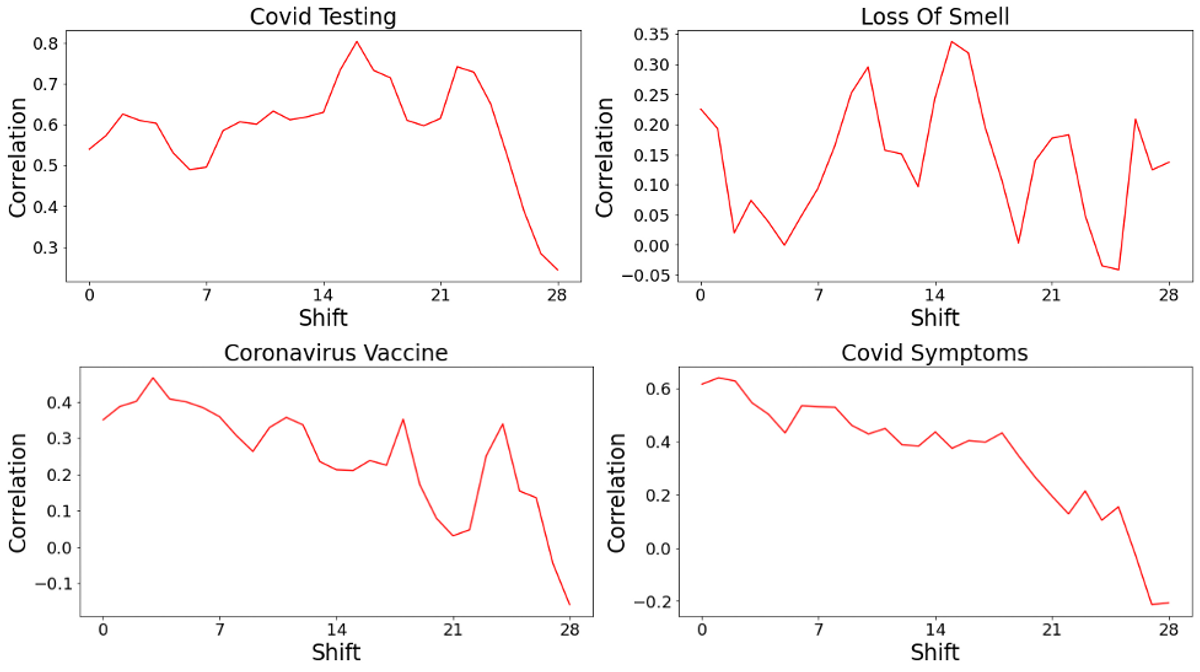
The shifted correlations between new cases and Google Trends data in the Boston area are quite similar to the results concerning the entire country. This trend seems to be most perceptible around the 17 to 18 day mark, where the largest correlations for “covid testing” and “loss of smell” can be found. For “coronavirus vaccine” and “covid symptoms”, the local 7-day maximum can also be found in this 2-day period. As a result, similar analysis could potentially be used to predict new cases up to 2.5 weeks in advance. While this shouldn’t be the basis of altering the university’s health guidelines, it may help as a first alert tool.
Conclusion
From our analysis, we found moderate to strong correlations between Google search trends and increases in COVID-19 cases. As Harvard plans to bring more students back to campus, this analysis might serve as a free tool to help administrators anticipate COVID-19 surges and prepare accordingly.