
Where do HODP's Accents come from?
Welcome to the HODP Tech Team’s first blog post! In our first board meeting of the year, we decided for fun to take the New York Times’ U.S. Dialect Quiz, and, inspired by the visualization and data collection of the NYT Upshot, I decided to collect some HODP members’ accent results and pick some new data viz skills on my own!
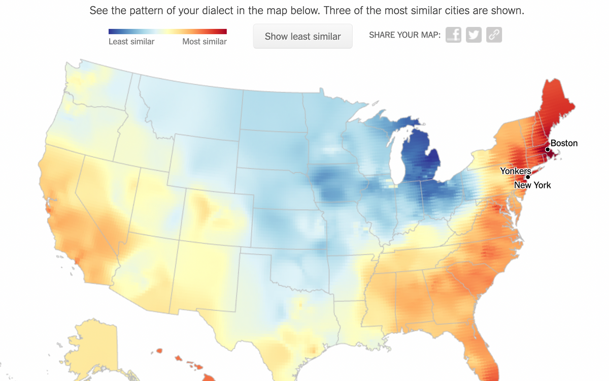
Welcome to the HODP Tech Team’s first blog post! In our first board meeting of the year, we decided for fun to take the New York Times’ U.S. Dialect Quiz, and, inspired by the visualization and data collection of the NYT Upshot, I decided to collect some HODP members’ accent results and pick some new data viz skills on my own! Take the quiz here to find out where your own accent comes from and see some stunning U.S. heat maps.
Over the summer, I was introduced to Tableau, a data visualization software, as I worked in my internship on Echelon Insights’ Middle America Project. Tableau was great for connecting conveniently and quickly to large data sources (in the forms of Excel and CSV files), and it created very aesthetic visualizations with fairly little fussing around or coding. However, I did more of the data cleaning work on this project than the visualization, so I wanted to use a small HODP dataset to start to get a feel for the program.
After taking a small survey of twelve HODP board members, I wanted to use Tableau Public to map out where our board comes from, where their accents come from, and the disparities between accent origins and real origins. The first step? Cleaning up my simple Google Form responses and adding geographic fields for Tableau to be able to digest. Starting from this:
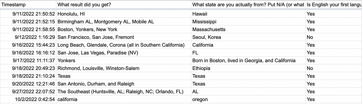 Starting spreadsheet of survey responses
I added some fields to import this into Tableau:
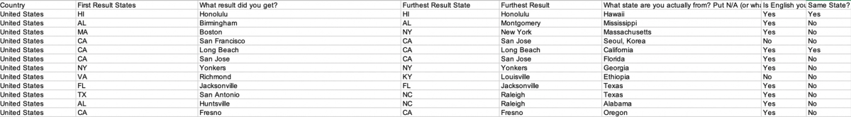 Cleaned spreadsheet for accent quiz data
Once my data was in Tableau, here is what the interface to connect my data looked like:
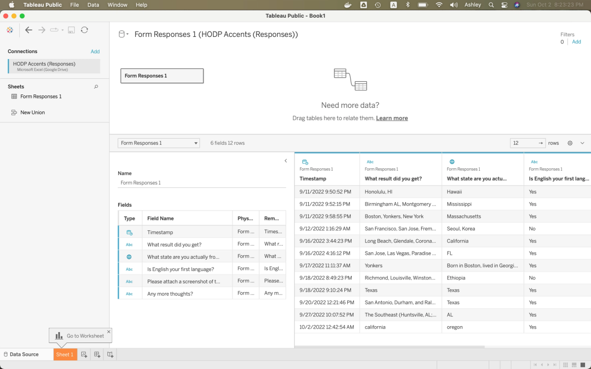 Tableau data workbook
But there was one big frustration: Tableau ran very slowly on my computer when I was trying to create my map sheet! Here’s a screen I encountered too frequently:
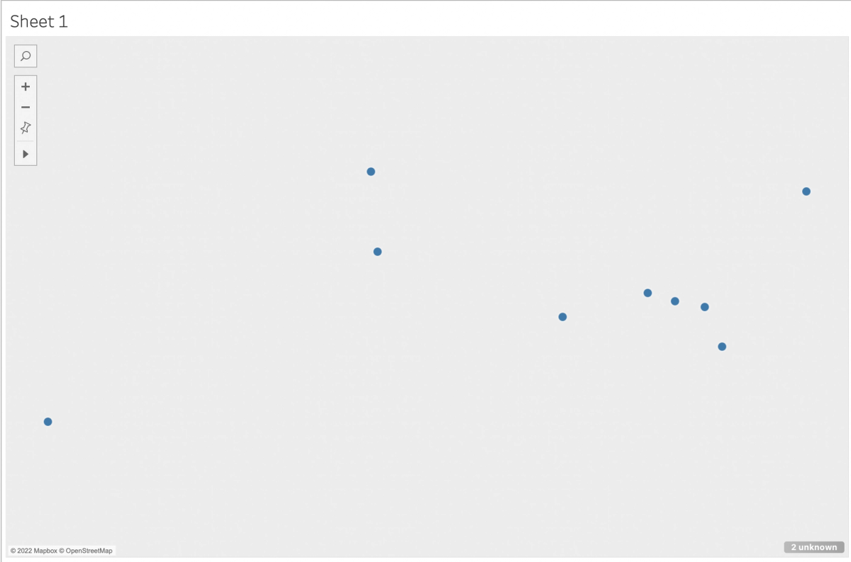 Tableau being laggy :(
It also took some time and many tutorials to figure how to map more than one column of points on the same map. With more time spent on Tableau, I might even be able to connect the origin points with people’s accent points. However, after learning the basics of Tableau’s filters, marking system, and dashboard creation, I created three maps! The first map displays HODP’s original geographic backgrounds (excluding our two respondents outside of the U.S. because it was difficult to map points of different countries when considering U.S. states😭). Next, we have a map of HODP’s geographic backgrounds and leading accent results (since the quiz gives you three cities), and I chose to compare with the first result people inputted into the Google Form. The final map compares geographic backgrounds with accents from the cities furthest to their geographic origins, which I found manually by looking through the responses. (The last map only worked because my dataset was small, but it was cool nonetheless!)
One final perk of Tableau is how easily I can embed the interactive maps! Look below to play around with my beginner visualization!
Here is a map of people's original home states and cities:
HODP Accent Map - Origins
Here is the first map overlaid with people's top accent results:
HODP Accent Quiz Maps - Origin and Foremost
And here is the first map overlaid with the furthest results each person received:
HODP - Origin and Furthest
To keep going further, I would try to connect the dots for each person's original home state and their accent results, but these preliminary maps provide an interesting picture of how differently the NYT distributes our possible home locations, based on linguistic questions!
Overall, I’d rate this experience of scratching the surface with Tableau Public a 7/10; I can tell that there are a TON of capabilities (look here for amazing visualizations!), but the slowness of the program on my computer and my lack of experience make the learning curve difficult to climb in a short amount of time. Stay tuned for more data visualization experiments!